Appearance
Skip to content
Using widths and sizes
NOTE
All interactive elements must be at least 24x24 pixels in size so that users are able to click them. This library uses size primitives of 40px (small) and 48px (default) for all interactive elements.
Add width via prop
template
<Card min-content title='min-content' />
<Card tiny title='tiny' />
<Card buttonWidth title='buttonWidth' />
<Card small title='small' />
<Card medium title='medium' />
<Card auto title='auto' />
<Card width="170.5px" title='width=170.5px' />
<Card full title='full' />min-content
tiny
buttonWidth
small
medium
auto
width=170.5px
full
Small height and square aspect ratio
template
<Button outline icon="bi-star"/>
<Button outline icon="bi-star large"/>
<Button outline square-small icon="bi-star" />
<Button outline square-small icon="bi-star large" />
<Button primary square >b</Button>
<Button primary >c</Button>
<Button primary square-small >a</Button>
<Button primary low-height >e</Button>template
<Link icon="bi-star" to="https://funkwhale.audio"/>
<Link square-small icon="bi-star"  to="https://funkwhale.audio"/>
<Link square-small  to="https://funkwhale.audio">g</Link>
<Link square  to="https://funkwhale.audio">h</Link>
<Link  to="https://funkwhale.audio">i</Link>
<Link square-small  to="https://funkwhale.audio">j</Link>
<Link low-height  to="https://funkwhale.audio">k</Link>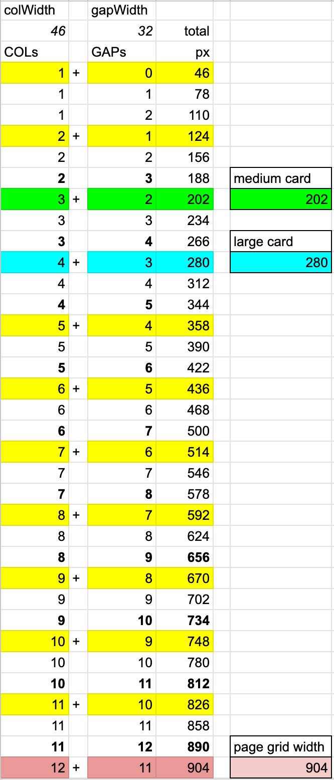
<Link square low-height to="https://funkwhale.audio">l</Link>Widths in the grid
Default widths