Appearance
Skip to content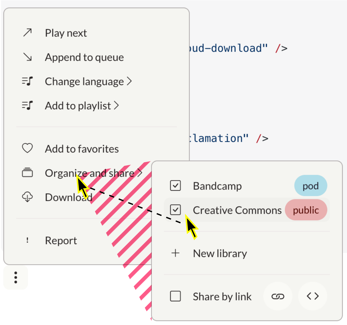
Bind to
WARNING
This component will be deprecated soon and replaced with a Menu component that implements more Accessibility best practices.
ts
import Popover from "@ui/Popover.vue"Popover (Dropdown Menu)
Popovers (Popover) are dropdown menus activated by a button. Use popovers to create dropdown menus ranging from simple lists to complex nested menus.
A11y issues
This component has severe usability issues and cannot be used as-is.
Add keyboard operability
I can't operate the popup with a keyboard. Remove barrier for people not using a mouse.
✅ All items can be focused and activated by Space (use <button> element instead of <div>)
Tab order: Users can go to the next and previous items with Tab and Shift+Tab. When they have opened a sub-menu, the next focusable element is inside the sub-menu. When they have closed it, the focus jumps back to where it was.
Dismissal: Users can close a menu or sub-menu with ESC
Arrow keys: Users can move up and down a menu, open sub-menus with -> and close them with <-. For reference, this pattern is properly implemented in Nav.vue.
Implement expected behavior
Switching to submenus is error-prone. When moving cursor into freshly opened submenu, it should not close if the cursor crosses another menu item.
Dead triangle: Add a triangular invisible node that covers the possible paths from the current mouse position to the menu items.
Large menus disappear. I can't scroll to see all options.
Submenu-to-Modal: Lists longer than 12 or so items are not recommended and should be replaced with modals.
Submenus open without a delay, and they don't close unless I click somewhere outside them, which goes against established expectations.
Expansion delay: Sub-menus open after 200ms
Auto-close: Sub-menus close when the outside is hovered. There may be a delay of 200ms. Menus close when they lose focus.
Common UI libraries in the Vue ecosystem such as vuetify or shadcn-vue all implement these features. It may be prudent to use their components.
Quick mitigation tactics
- Place complex interfaces into nested
Modals - Place long lists into native
<Select>elements - Avoid sub-menus
Common uses:
- "More actions" dropdown menus
- Navigation menus
- Settings menus
- Context menus (right-click menus)
ts
const { positioning = 'vertical', ...colorProps } = defineProps<{
  positioning?: 'horizontal' | 'vertical'
} & (ColorProps | DefaultProps) & RaisedProps>()ts
const isOpen = defineModel<boolean>({ default: false })template
<Popover>
  <template #default="{ toggleOpen }">
    <OptionsButton @click="toggleOpen" />
  </template>
</Popover>Destructure the function toggleOpen and let a default dropdown button: OptionsButton trigger it. This way, the state of the component is encapsulated.
NOTE
When the user selects an action, the popover menu flashes twice (<= 3 times, as recommended by the WCAG) before closing (see PopoverItem.vue for the exact constants).
Bind to isOpen
If you want to process or influence the expansion of the menu in the containing component, you can bind it to a ref.
Use Vue event handling to map the button to a boolean value.
vue
<script setup lang="ts">
  const isOpen = ref(false)
</script>

<template>
  <Popover v-model="isOpen">
    <OptionsButton @click="isOpen = !isOpen" />
  </Popover>
</template>Customize the dropdown button
vue
<script setup lang="ts">
const open = ref(false);
const privacyChoices = ["pod", "public", "private"];
const bcPrivacy = ref("pod");
</script>

<template>
  <Popover v-model="isOpen">
    <template #default="{ toggleOpen }">
      <Pill
        @click="
          (e) => {
            console.log('Pill clicked');
            console.log('Before toggleOpen:', isOpen);
            toggleOpen();
            console.log('After toggleOpen:', isOpen);
          }
        "
        :blue="bcPrivacy === 'pod'"
        :red="bcPrivacy === 'public'"
      >
        {{ bcPrivacy }}
      </Pill>
    </template>
    <template #items>
      <PopoverRadio v-model="bcPrivacy" :choices="privacyChoices" />
    </template>
  </Popover>
</template>Keep the popover open
By default, the popover closes when a radiobutton, link, or other item is chosen. The exception is with checkboxes because the user can select multiple options. Override the default behavior by setting the keep-open prop on any of the following components:
<PopoverRadio>- keep the popover open when any radio item is selected<PopoverRadioItem>- keep the popover open when a specific radio item is selected<PopoverItem>- keep the popover open when the link or button is activated<Popover>- keep the popover open when any item is selected (clicking outside the popover still closes it)
vue
<Popover v-model="keepOpen">
  <Toggle v-model="keepOpen" label="Show privacy controls" />
  <template #items>
    <PopoverRadio v-model="bcPrivacy" :choices="privacyChoices" keep-open />
  </template>
</Popover>Items
Popovers contain a list of menu items. Items can contain different information based on their type.
INFO
Lists of items must be nested inside a <template #items> tag directly under the <Popover> tag.
Popover item
The popover item (PopoverItem) is a simple button that uses Vue event handling. Each item contains a slot which you can use to add a menu label and icon.
vue
<script setup lang="ts">
  const alert = (message: string) => window?.alert(message)
  const open = ref(false)
</script>

<template>
  <Popover v-model="open">
    <OptionsButton @click="open = !open" />
    <template #items>
      <PopoverItem @click="alert('Report this object?')">
        <i class="bi bi-exclamation" />
        Report
      </PopoverItem>
    </template>
  </Popover>
</template>Checkbox
The checkbox (PopoverCheckbox) is an item that acts as a selectable box. Use v-model to bind the checkbox to a boolean value. Each checkbox contains a slot which you can use to add a menu label.
vue
<script setup lang="ts">
const bc = ref(false)
const cc = ref(false)
const open = ref(false)
</script>

<template>
  <Popover v-model="open">
    <OptionsButton @click="open = !open" />
    <template #items>
      <PopoverCheckbox v-model="bc">
        Bandcamp
      </PopoverCheckbox>
      <PopoverCheckbox v-model="cc">
        Creative commons
      </PopoverCheckbox>
    </template>
  </Popover>
</template>Radio
The radio (PopoverRadio) is an item that acts as a radio selector.
| Prop | Data type | Required? | Description |
|---|---|---|---|
modelValue | String | Yes | The current value of the radio. Use v-model to bind this to a value. |
choices | Array<String> | Yes | A list of choices. |
vue
<script setup lang="ts">
const open = ref(false);
const currentChoice = ref("pod");
const privacy = ["public", "private", "pod"];
</script>

<template>
  <Popover v-model="open">
    <OptionsButton @click="open = !open" />
    <template #items>
      <PopoverRadio v-model="currentChoice" :choices="choices" />
    </template>
  </Popover>
</template>Separator
Use a standard horizontal rule (<hr>) to add visual separators to popover lists.
vue
<script setup lang="ts">
const bc = ref(false)
const cc = ref(false)
const open = ref(false)
</script>

<template>
  <Popover v-model="open">
    <OptionsButton @click="open = !open" />
    <template #items>
      <PopoverCheckbox v-model="bc">
        Bandcamp
      </PopoverCheckbox>
      <hr>
      <PopoverCheckbox v-model="cc">
        Creative commons
      </PopoverCheckbox>
    </template>
  </Popover>
</template>Icon Prop
PopoverItem supports an icon prop to easily add icons to menu items. The icon prop accepts standard Bootstrap icon classes.
| Prop | Data type | Required? | Description |
|---|---|---|---|
icon | String | No | Bootstrap icon class to display before the item |
template
``` <PopoverItem icon="bi-music-note-list">
Play next
</PopoverItem>
<PopoverItem icon="right bi-share">
Share
</PopoverItem>Submenus
To create more complex menus, you can use submenus (PopoverSubmenu). Submenus are menu items which contain other menu items.
vue
<script setup lang="ts">
const bc = ref(false)
const isOpen = ref(false)
</script>

<template>
  <Popover v-model="isOpen">
    <OptionsButton @click="isOpen = !isOpen" />
    <template #items>
      <PopoverSubmenu>
        <i class="bi bi-collection" />
        Organize and share
        <template #items>
          <PopoverCheckbox v-model="bc">
            Bandcamp
          </PopoverCheckbox>
          <PopoverItem :to="{ name: 'learn-more' }">
              Learn more...
          </PopoverItem>
          <PopoverItem>Cancel</PopoverItem>
        </template>
      </PopoverSubmenu>
    </template>
  </Popover>
</template>Extra items
You can add extra items to the right hand side of a popover item by nesting them in a <template #after> tag. Use this to add additional menus or buttons to menu items.
vue
<script setup lang="ts">
const bc = ref(false)
const privacyChoices = ['public', 'private', 'pod']
const bcPrivacy = ref('pod')
const isOpen = ref(false)
</script>

<template>
  <Popover v-model="isOpen">
    <OptionsButton @click="isOpen = !isOpen" />
    <template #items>
      <PopoverSubmenu>
        <i class="bi bi-collection" />
        Organize and share
        <template #items>
          <PopoverCheckbox v-model="bc">
            Bandcamp
            <template #after>
              <Popover>
                <template #default="{ toggleOpen }">
                  <Pill @click.stop="toggleOpen" :blue="bcPrivacy === 'pod'" :red="bcPrivacy === 'public'">
                    {{ bcPrivacy }}
                  </Pill>
                </template>
                <template #items>
                  <PopoverRadio v-model="bcPrivacy" :choices="privacyChoices"/>
                </template>
              </Popover>
            </template>
          </PopoverCheckbox>
          <hr>
          <PopoverCheckbox v-model="share">
            Share by link
            <template #after>
              <Button ghost @click.stop="alert('Link copied to clipboard')" round icon="bi-link" />
              <Button ghost @click.stop="alert('Here is your code')" round icon="bi-code" />
            </template>
          </PopoverCheckbox>
        </template>
      </PopoverSubmenu>
    </template>
  </Popover>
</template>Links
You can use PopoverItems as Links by providing a to prop with the route object or and external Url (http...). Read more on the Link component page.
Menu
Here is an example of a completed menu containing all supported features.
vue
<script setup lang="ts">
const isOpen = ref(false);
const bc = ref(false);
const cc = ref(false);
const share = ref(false);
const bcPrivacy = ref("pod");
const ccPrivacy = ref("public");
const privacyChoices = ["private", "pod", "public"];
</script>

<template>
  <Popover v-model="isOpen">
    <OptionsButton @click="isOpen = !isOpen" />
    <template #items>
      <PopoverSubmenu>
        <i class="bi bi-music-note-list" />
        Change language
        <template #items>
          <PopoverItem
            v-for="(language, key) in SUPPORTED_LOCALES"
            :key="key"
            @click="()=>{ alert(`Chosen language: ${language} (${key})`) }"
          >
            {{ language }}
          </PopoverItem>
        </template>
      </PopoverSubmenu>
      <PopoverItem>
        <i class="bi bi-arrow-up-right" />
        Play next
      </PopoverItem>
      <PopoverItem>
        <i class="bi bi-arrow-down-right" />
        Append to queue
      </PopoverItem>
      <PopoverSubmenu>
        <i class="bi bi-music-note-list" />
        Add to playlist
        <template #items>
          <PopoverItem>
            <i class="bi bi-music-note-list" />
            Sample playlist
          </PopoverItem>
          <hr />
          <PopoverItem>
            <i class="bi bi-plus-lg" />
            New playlist
          </PopoverItem>
        </template>
      </PopoverSubmenu>
      <hr />
      <PopoverItem>
        <i class="bi bi-heart" />
        Add to favorites
      </PopoverItem>
      <PopoverSubmenu>
        <i class="bi bi-collection" />
        Organize and share
        <template #items>
          <PopoverCheckbox v-model="bc">
            Bandcamp
            <template #after>
              <Popover>
                <template #default="{ toggleOpen }">
                  <Pill
                    @click.stop="toggleOpen"
                    :blue="bcPrivacy === 'pod'"
                    :red="bcPrivacy === 'public'"
                  >
                    {{ bcPrivacy }}
                  </Pill>
                </template>
                <template #items>
                  <PopoverRadio v-model="bcPrivacy" :choices="privacyChoices" />
                </template>
              </Popover>
            </template>
          </PopoverCheckbox>
          <PopoverCheckbox v-model="cc">
            Creative Commons
            <template #after>
              <Popover v-model="isOpen">
                <template #default="{ toggleOpen }">
                  <Pill
                    @click="toggleOpen"
                    :blue="ccPrivacy === 'pod'"
                    :red="ccPrivacy === 'public'"
                  >
                    {{ ccPrivacy }}
                  </Pill>
                </template>
                <template #items>
                  <PopoverRadio v-model="ccPrivacy" :choices="privacyChoices" />
                </template>
              </Popover>
            </template>
          </PopoverCheckbox>
          <hr />
          <PopoverItem>
            <i class="bi bi-plus-lg" />
            New library
          </PopoverItem>
          <hr />
          <PopoverCheckbox v-model="share">
            Share by link
            <template #after>
              <Button @click.stop ghost round icon="bi-link" />
              <Button @click.stop ghost round icon="bi-code" />
            </template>
          </PopoverCheckbox>
        </template>
      </PopoverSubmenu>
      <PopoverItem>
        <i class="bi bi-cloud-download" />
        Download
      </PopoverItem>
      <hr />
      <PopoverItem>
        <i class="bi bi-exclamation" />
        Report
      </PopoverItem>
    </template>
  </Popover>
</template>Using this component
A11y Checklist
Accessible Popover
- Add
autofocusto the first item of any menu or submenu. This will move the focus into the popover as it opens, and move it back to the previous position when it closes. - Make sure to add the
toprop (for navigation purposes) or@clickprops (triggering an action) to eachPopoverItemfor automatic compatibility with assistive technology.
template
<Popover>
  <template #default="{ toggleOpen }">
    <OptionsButton @click="toggleOpen" />
  </template>
  <template #items>
    <PopoverItem
      autofocus
      @click="() => { }"
    >
      Do nothing
    </PopoverItem>
  </template>
</Popover>