
Appearance
Skip to content... ... 
ts
import Card from '~/ui/Card.vue'Card
Organize textual information, links, and interactive buttons in card-sized sections
ts
const {
  uiShadow = true,
  uiInlineSize = ui.inlineSize['208'],
  ...props
} = defineProps<WithAttributes<{
  /**
    * Pass `RouterLink` or use the `to()` helper from `~/routing`
    * @default `<a>` tag
    */
  is?: Component | 'a'

  class: {
    color?: Extract<Color, `${string}-solid`>
  }

  title: string
  category?: true | 'h1' | 'h2' | 'h3' | 'h4' | 'h5'

  tags?: string[]
  image?: string | { src: string, style?: 'withPadding' | 'circle', label?: string }
  icon?: string

  uiShadow?: boolean

  /**
   * Small card: 128
   * Medium card: 208
   * Large card: 288
   */
  uiInlineSize?: '128' | '208' | '288'

  uiSpanAll?: boolean

  /**
  * Only use when the default role of a semantic element is not enough.
  */
  role?: string
} & Labeled>>()Card as a Link
Add a :to prop, either containing an external link ("https://...") or a Vue Router destination:
Link
Click heretemplate
<Card
  title="Link"
  href="https://funkwhale.audio"
>
  Click here
</Card>If you add interactive elements, only the surrounding surfaces will be linked.
Avoid overlapping interactive elements
Avoid adding buttons and links on top of a linked card. This is an uncommon pattern and will confuse users.
template
<Alert class="color-red-solid">
  <Card
    is="a"
    href="./card.md"
    class="color-primary-solid"
    title="Linked card with interactive elements (confusing)"
    :tags="['rock', 'folk', 'punk']"
    icon="bi:exclamation"
  >
    <Button
      ui-block-size="40"
      :on-click="() => alert('Button clicked')"
    >
      Click me!
    </Button>

    <Link href="./card.md">
      Open this file in a new window
    </Link>
  </Card>
</Alert>

<Alert>
  <Card
    title="Card with interactive elements (better)"
    :tags="['rock', 'folk', 'punk']"
    icon="bi:check-lg"
  >
    <Button
      ui-block-size="40"
      :on-click="() => alert('Button clicked')"
    >
      Click me!
    </Button>

    <Link href="./card.md">
      Open this file in a new window
    </Link>
    <template #action>
      <Link
        class="color-primary-solid shape-field-grow"
        href="./card.md"
      >
        Go!
      </Link>
    </template>
  </Card>
</Alert>Card as a Category header
Category cards are basic cards that contain only a title. To create a category card, pass a category prop.
My Favorites
What others listen to
Choosing the right heading level
Make sure to implement accessible heading trees. Do not skip heading levels (h1..h7).
The default title will be rendered as a h6. To override, set category="h3". Note that this behavior will change in the next update.
template
<Card
  flat
  solid
  purple
  category
  min-content
  title="My Favorites"
/>...
<Card
  category="h1"
  title="What others listen to"
/>...INFO
For details on link behavior, consult the Vue Router docs on RouterLink.
Add an Image
Pass an image source to the image prop or set both image.src and image.style by passing an object.
INFO
Make sure to pass a label parameter to the image prop unless it is purely decorative.
For music lovers
For music lovers
template
<Card
  small
  title="For music lovers"
  image="https://images.unsplash.com/photo-1524650359799-842906ca1c06?ixlib=rb-1.2.1&dl=te-nguyen-Wt7XT1R6sjU-unsplash.jpg&w=640&q=80&fm=jpg&crop=entropy&cs=tinysrgb"
/>
<Card
  title="For music lovers"
  :image="{
    src: 'https://images.unsplash.com/photo-1524650359799-842906ca1c06?ixlib=rb-1.2.1&dl=te-nguyen-Wt7XT1R6sjU-unsplash.jpg&w=640&q=80&fm=jpg&crop=entropy&cs=tinysrgb',
    style: 'withPadding',
    label: 'Funkwhale users rejoice'
  }"
/>Add an Icon
Uploading...
template
<Card
  title="Uploading..."
  image="https://images.unsplash.com/photo-1524650359799-842906ca1c06?ixlib=rb-1.2.1&dl=te-nguyen-Wt7XT1R6sjU-unsplash.jpg&w=640&q=80&fm=jpg&crop=entropy&cs=tinysrgb"
  icon="bi:cloud-arrow-up-fill"
/>You can combine this prop with any other prop configuration. If you combine it with an image, keep an eye on the contrast ratio between the icon color and the image.
Add an Alert
INFO
To add props to the alert, add the alert-props property to the card. Check out the Alert component docs to find out which props are supported;
Your Collection
Please annotate all items with the required metadata.template
<Card
  title="Your Collection"
  :alert-props="{ red: true }"
>
  <template #alert>
    Please annotate all items with the required metadata.
  </template>
</Card>Use slots
Topright action
Contextual actions go to the top-right of the Card.Footer
Items in the footer region are secondary and will be displayed smaller than the main content.Call-to-Action
Large Buttons or links at the bottom edge of the card serve as Call-to-Actions (CTA).Multiple actions
If there are multiple actions, they will be presented in a row.template
<Card title="Topright action">
  Contextual actions go to the top-right of the Card.
  <template #topright>
    <OptionsButton square-small />
  </template>
</Card>

<Card
  medium
  title="Footer"
>
  Items in the footer region are secondary and will be displayed smaller than the main content.
  <template #footer>
    <Button
      @click="alert('Uploaded. Press OK!')"
    >
      <Icon icon="bi:upload" />

      Upload
    </Button>
    <Spacer style="flex-grow: 1" />
    <OptionsButton />
  </template>
</Card>

<Card
  medium
  title="Call-to-Action"
>
  Large Buttons or links at the bottom edge of the card serve as Call-to-Actions (CTA).
  <template #action>
    <Button
      class="shape-field-grow"
      @click="alert('Open the pod picker')"
    >
      Action!
    </Button>
  </template>
</Card>

<Card
  full
  title="Multiple actions"
>
  If there are multiple actions, they will be presented in a row.
  <template #action>
    <Button class="color-default-ghost justify-start shape-field-minimal">
      <Icon icon="bi:chevron-left" />

      Items
    </Button>
    <Spacer
      h
      grow
    />
    <Button
      class="color-primary-solid"
      @click="alert('Yay')"
    >
      OK
    </Button>
    <Button
      class="color-destructive-solid"
      @click="alert('Yay')"
    >
      Cancel
    </Button>
  </template>
</Card>Add Tags
You can include tags on a card by adding a list of tags. These are rendered as Tokens.
For music lovers
Access your personal music collection from anywhere. Funkwhale gives you access to publication and sharing tools that you can use to promote your content across the web. #rock #folk #punktemplate
<Card
  medium
  title="For music lovers"
  :tags="['rock', 'folk', 'punk']"
>
  Access your personal music collection from anywhere.
  Funkwhale gives you access to publication and sharing tools
  that you can use to promote your content across the web.
</Card>Differentiate mixed cards visually
Consider differentiating cards by color, size and shadow when mixing several of the following types:
- Cards used for organizing the page spatially
- Cards that represent objects
- Interactive cards (buttons or links)
Add color
Deprecation
Use color classes instead.
- Choose a color:
default,primary,secondary,destructive, or a Pastel (red, yellow, purple, green or blue) - Choose a variant:
raised,solid,outline,...
Set size
Deprecation
Use ui-inline-size custom attribute instead.
large (304px), medium (208px), auto, small, ...
Remove shadow
Use the flat attribute to remove the automatic shadow. This helps reduce visual noise and differentiates cards.
Using this component
A11y Checklist
Accessible card
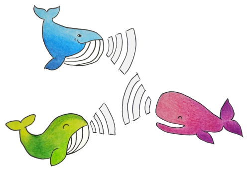
Link
template
<Card
  title="Card"
  :category="level"
  :image="{
    src: whales,
    label: 'Colorful whales communicating in a network'
  }"
  :tags="['Tag']"
  icon="bi:check-lg"
>
  <Link to="https://funkwhale.audio">
    Inline link
  </Link>
  <template #action>
    <Link
      solid
      grow
      to="./"
    >
      Action link
    </Link>
  </template>
</Card>
<Card
  to="./"
  title="Link"
  :category="level"
>
  <template #topright>
    <OptionsButton
      title="More"
      aria-label="Toggle Card menu"
      @click.stop.prevent="toggleMenu"
    />
  </template>
</Card>